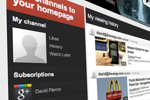
While a quick tweak let users enable the YouTube design early, the completely redesigned site is available now for everyone. You’ll first notice the homepage has been completely reorganized into three columns that prominently feature your subscriptions along the left side. The center column initially shows all the latest videos from channels you’ve subscribed to, and the dark left column functions as a nav bar, so you can dive down into videos from your Google+ contacts and channels you’ve subscribed to. It’s now much easier to quickly switch between your personal videos, likes, history, and Watch Later options, and they’re all integrated in the top left of the page.
via The Verge.

